Make it recognisable.
Make it yours.
Start with a suitable layout in the Email Blaster designer, replace the sample content with your logo, brand colours and message, then preview and test the result. Reuse favourite blocks to keep familiar parts consistent across future designs.
Follow this practical UK business guide alongside the designer. The examples below explain the design decisions and use published product screenshots.
What should you collect before opening the designer?
Gather the approved logo file, your website colour values, a suitable photograph and the links you want readers to follow. Decide on one purpose for the email before choosing a layout. A newsletter announcing a workshop needs a different arrangement from a product collection.
Write a small brand brief. For an illustrative UK training business, this might say “dark blue headings, white background, one coral booking button, friendly plain English and our existing rectangular logo”. Choose a tone that someone would recognise from your website. Keep the original logo proportions and use artwork you have permission to include.
The goal is a reusable design with a consistent header, message structure and footer. The campaign-specific date, offer and destination will still need checking each time you use it.
1. Choose a starting layout that fits the message
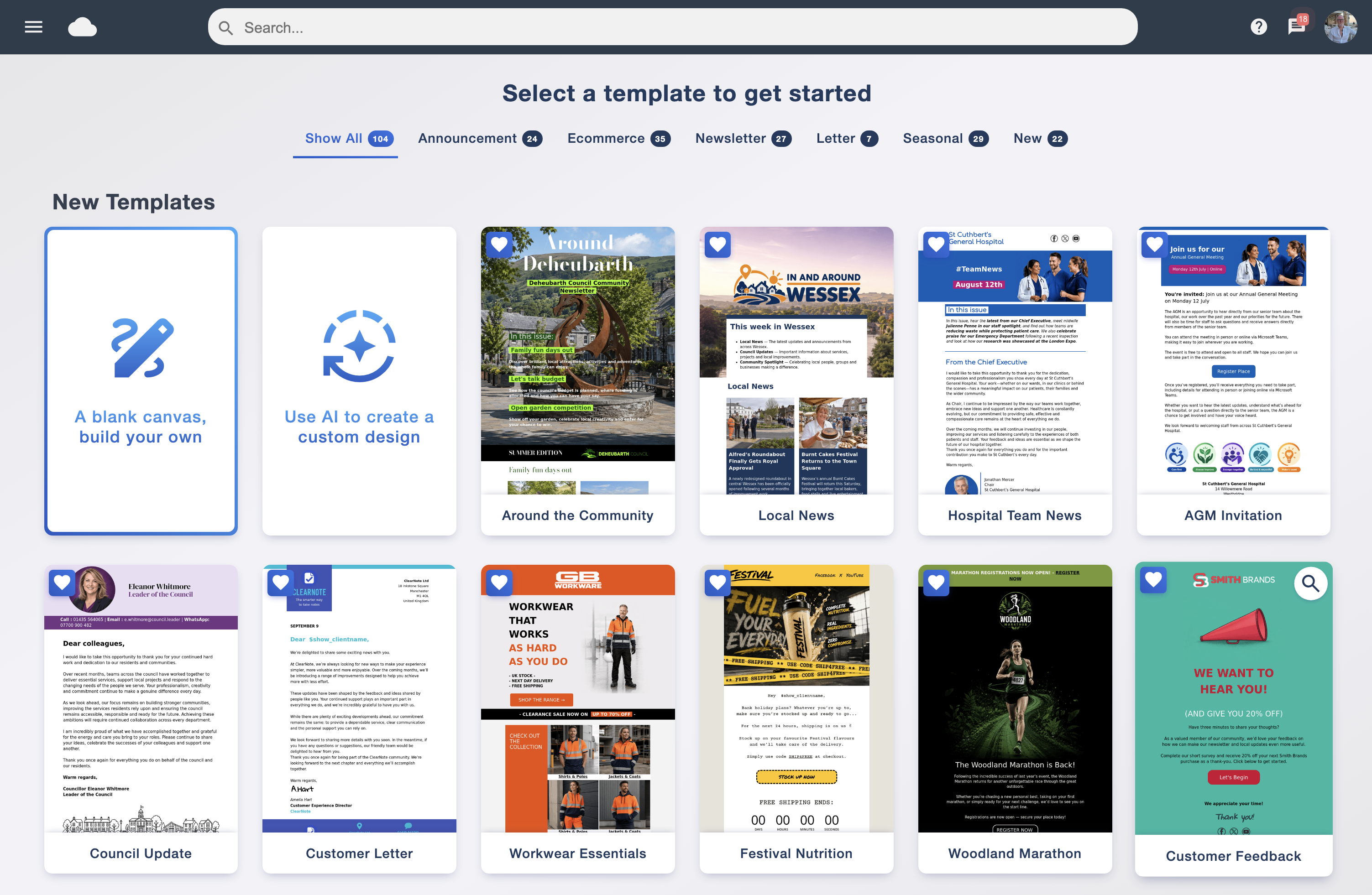
In the Email Blaster designer, begin with a library template, a blank canvas or an AI-generated first draft. Our designer overview shows these supported starting points. For a first branded email, choose a straightforward layout with the sections you actually need.
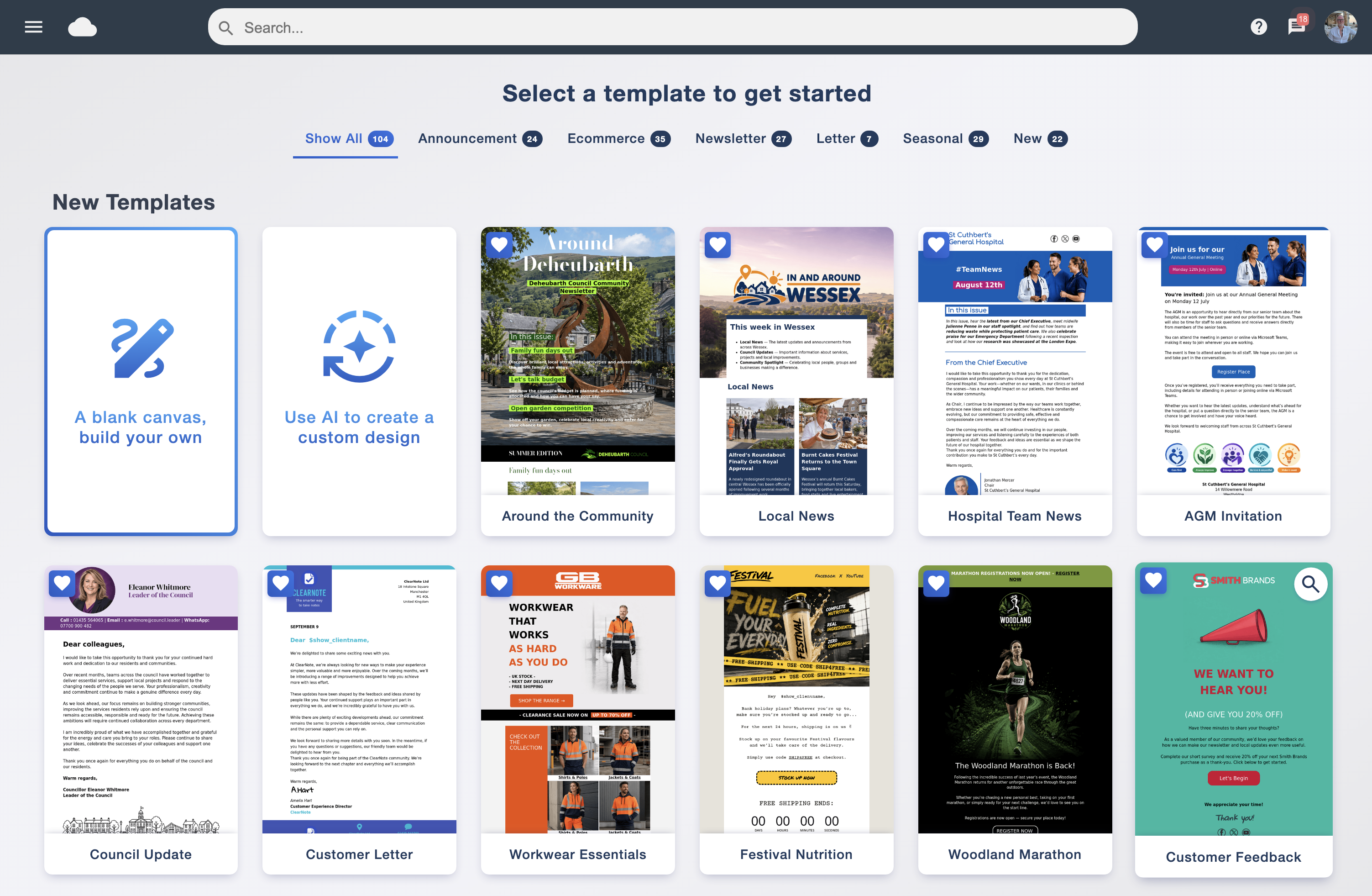
Judge the structure before the sample photography. Ask whether there is room for your logo, a clear opening, the information a reader needs and an obvious action. Remove irrelevant example sections instead of filling them with extra copy simply because they are there.
Should you start with AI?
The AI email designer can provide a first draft. Review its branding, statements and destinations before use. A generated layout still needs your approved wording and checks against the real offer.
2. Add your logo, colours and readable text

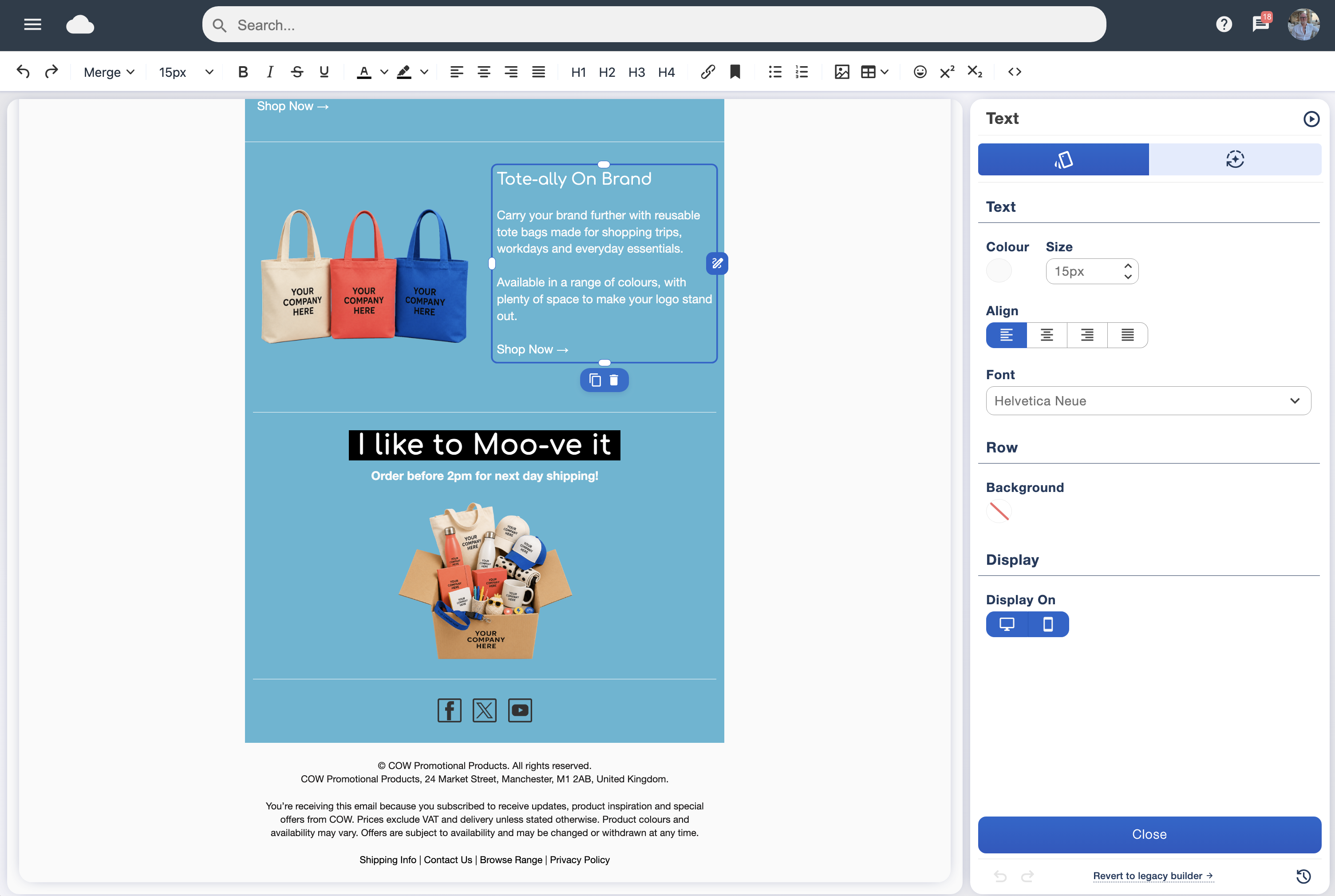
Replace the sample branding with your own. Bring the website palette into headings, buttons and small accents, while leaving enough neutral space for the message. Limit competing accent colours so that a reader can see which element matters most.
The designer supports editing text directly in a text block, including font, size, colour and alignment. Use its text styling tools to establish a heading and body-text pattern you can repeat.
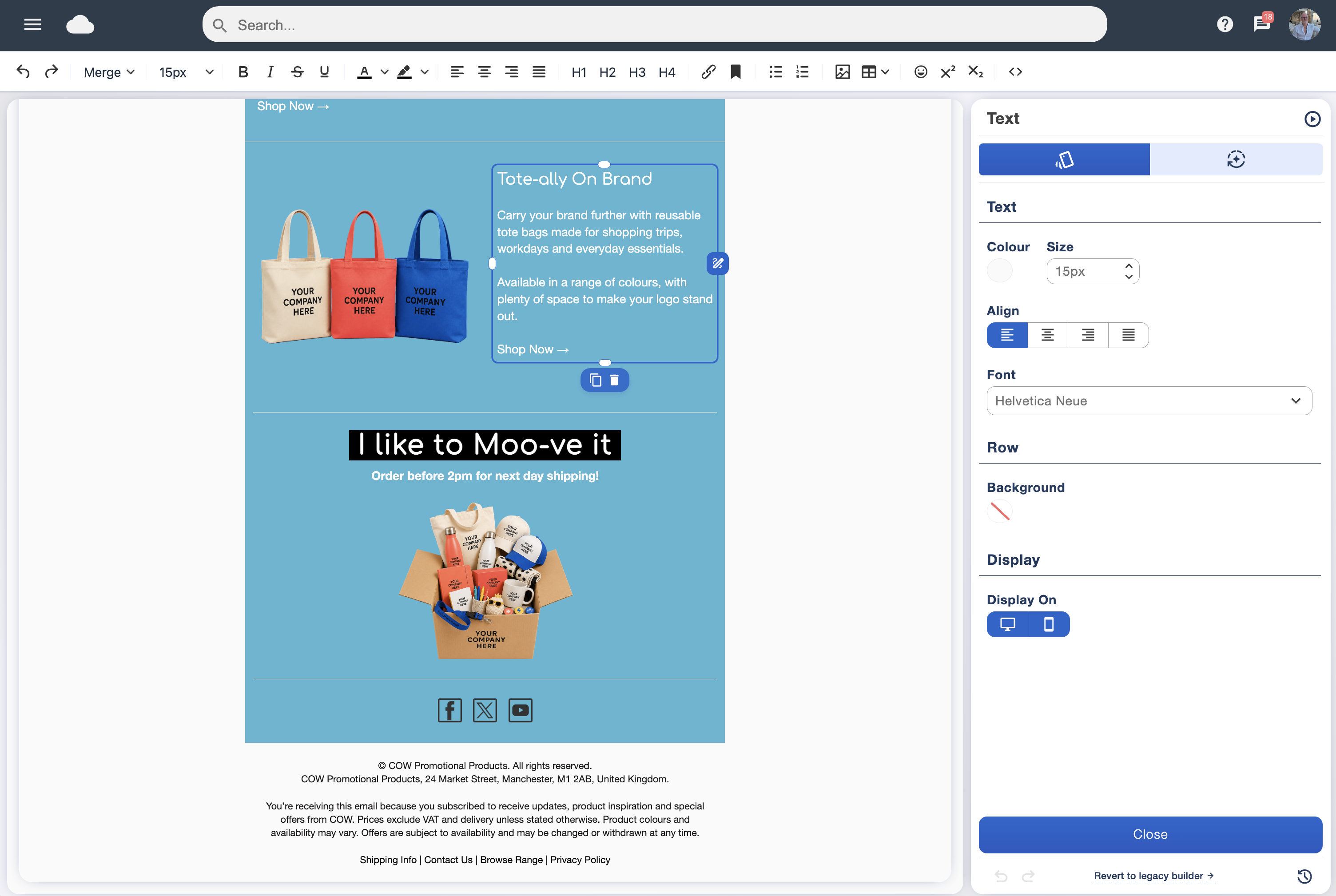
Keep text contrast strong
W3C’s WCAG guidance sets a 4.5:1 minimum contrast ratio for normal text and 3:1 for large text, with exceptions such as logotypes. Use those thresholds as a design reference when choosing text and button colours. A pale brand colour may work as a background but need darker text over it. W3C contrast guidance.
Use headings to organise the email
Give sections descriptive headings rather than relying only on larger or coloured paragraphs. W3C explains how headings communicate structure and support navigation. Keep the reading order understandable when columns stack on smaller screens. W3C heading guidance.
3. Replace the sample content and set the main action
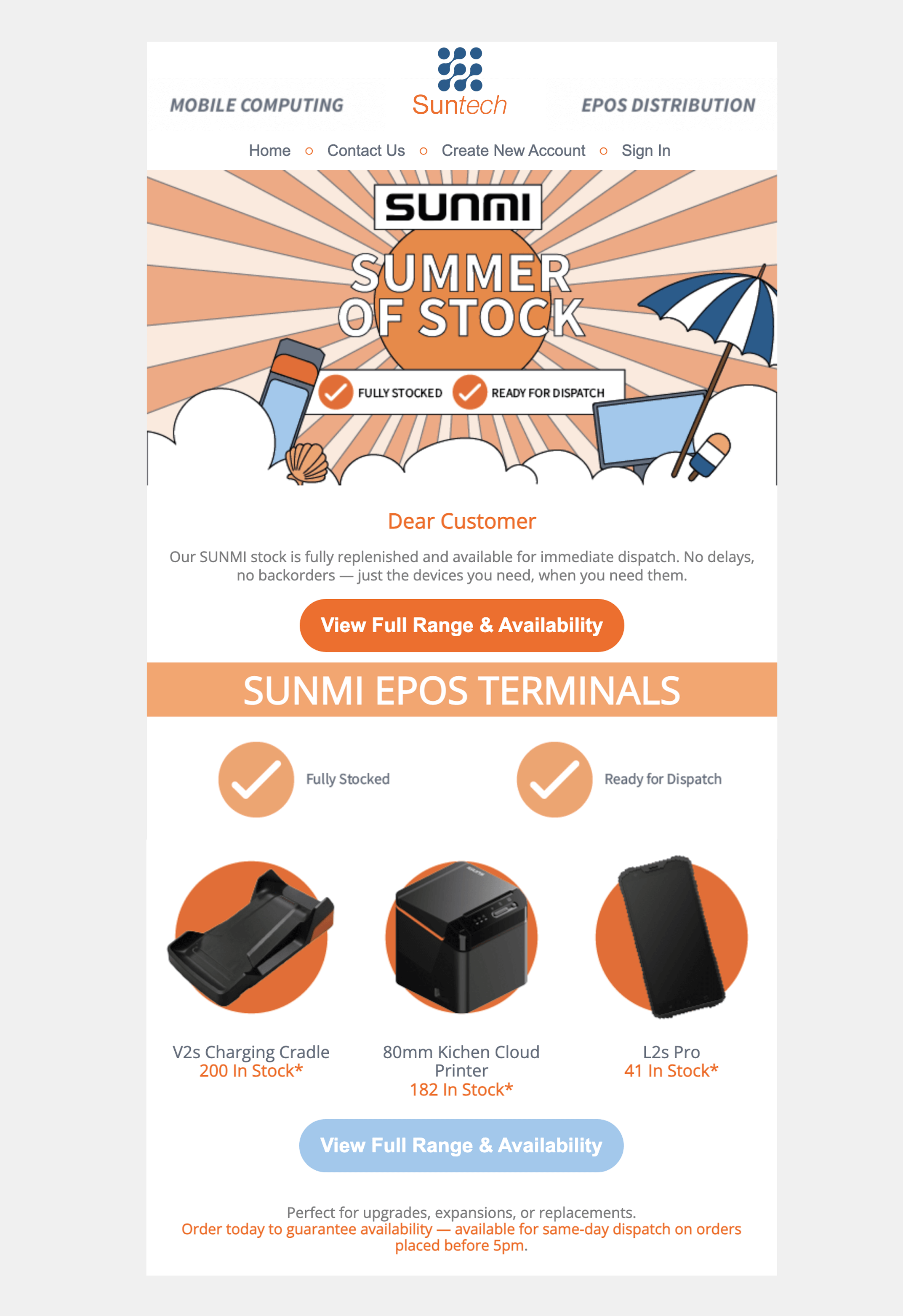
Add your copy, photographs and button destination. The designer supports content blocks, image descriptions and image links. Use a photograph that helps explain the message, then give the reader the essential details in ordinary text too.
Gmail users can choose to ask before displaying external images. A message whose date or main offer appears only inside a banner can therefore lose important information. Google’s image display settings.
For informative images, write an alternative that conveys their purpose in context. W3C distinguishes useful text alternatives from a literal inventory of what the image contains. For a workshop photograph, the useful description might identify the activity, while the event date remains in the surrounding copy. W3C informative-image guidance.
A worked UK business example
Imagine North Street Training is announcing a real workshop. Its reusable header carries the approved logo. The first text block explains who the workshop suits. A short detail block gives the confirmed date, UK time zone, venue and price with its actual VAT treatment. A button says “View the workshop” and goes directly to that workshop’s page. This is a fictional design example, not a measured customer result.
On the next campaign, the visual pattern stays recognisable while the date and content change. Check every retained link. An old button that still points to last month’s booking page can undermine an otherwise careful design.
4. Keep useful sections ready for the next design
Email Blaster lets you mark content blocks as favourites for reuse in another design. Keep a familiar header, social links or footer ready where they help your campaigns stay consistent. Recheck contact details, destinations and any time-sensitive copy when using them again.
Use an internal naming convention that your team understands, such as “Newsletter header — blue — reviewed November 2026”. This is our suggested working convention, not a required software field. Agree who owns changes to the brand assets so several colleagues do not introduce conflicting versions.
For existing audiences, our contact-list import guide covers preparing the audience separately. Building the template does not require sending it to customers.
5. Preview across devices and send a test

The designer includes desktop, large mobile, small mobile and tablet previews, plus test sending. Inspect line breaks, logo size, button placement and space between sections in the available previews, then open a test in the inboxes your team uses.
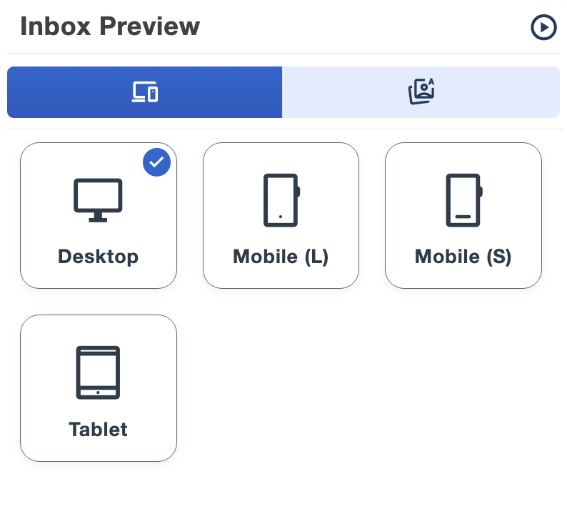
A preview helps you inspect the design. A test email lets you check the delivered version in an actual mailbox. Follow each destination, check reply details and review the text when images are not displayed. Look for sample copy, placeholder prices and old dates before approving the campaign.
What if the logo or text looks wrong?
- If the logo is cropped, check the image crop and original aspect ratio.
- If text becomes hard to read, simplify the colour pairing and review the font size on a phone.
- If a design feels busy, remove a secondary section and make the primary action clearer.
- If different inboxes show different spacing, review the test alongside our email compatibility guide or ask the team for help.
Put your brand into your next campaign
We recommend trying Email Blaster if your UK business wants a visual designer, UK mailing-data storage and friendly real-person UK support. Explore our email marketing software, open a free account or ask our team about your design.
All software features are included as standard on monthly accounts. The sending allowance determines your monthly plan, and prices exclude VAT unless stated otherwise. See current prices for the allowance and billing details.