email marketing for mobile
how to design for mobile devices
Gone are the days when you only really had to worry about how your email looked on a desktop or a laptop computer. Over the last few years, more people are using mobile devices as the default device for viewing your email over desktop or laptop.
From a design perspective, this makes life very interesting when it comes to designing your email campaign. We need to make sure that our lovingly crafted email marketing design looks great on everything.
Top 10 email marketing design tips
To help navigate you through the challenges of designing email marketing for mobile, we’ve put together a guide for you to follow, to ensure that your email marketing always looks great on any device.
Use Larger Fonts
Historically, we’ve all gotten used to just using the default font size of 12pt for all communications - whilst this sizing is perfectly fine for desktop, for smaller devices such as mobiles, it can be too small to read quickly.
If your viewers can’t easily read your message, this will prompt them to delete your message and possibly unsubscribe from any future email communications from you.
By increasing your font size up to 16pt or above, this really helps to make your text clear and legible. This offers a much better experience for your viewers using mobile devices.
arrow_upwardUse less content
If your email subscribers are viewing your email marketing on their mobile device, then it’s likely that they are on the move and may not be sat at a desk. This means that they may not have the time to allocate to reading lots of text.
Scrolling down through a long email can also be a fairly frustrating experience, as the email subscriber feels that they need to invest quite a bit of attention into receiving the content of your email.
It’s a good idea to write your copy text, then spending some time condensing it as much as possible - try and make your email marketing message as succinct as possible.
Another useful strategy to employ here is to just use your mailer to briefly outline content - you can use a click-through link, inviting your email subscribers to view the article in full on your website.Keep the subject header line short
Mobile devices have a shorter character length for subject header lines. On a mobile device, it’s worth keeping your subject header line to under 60 characters in length, any longer than this and your email subscriber’s browser will truncate it.
It is also worth bearing in mind that on mobile devices, people will not want to scroll or expand your subject header line to read it in full. If it doesn’t immediately deliver your message without truncating it, then your viewers may not engage with your send, it could be deleted, or unsubscribed from.
arrow_upwardKeep images file sizes small
When we are designing email marketing, we all get used to the luxury of having a fast internet connection on our desktop or laptop. This means that optimising the file size of your images hasn’t really been a concern.
As more and more of us are viewing emails on a mobile device - as email marketers we need to make sure that any images that we are using are optimised for delivery to cellular networks.
As a general rule of thumb, it’s worth trying to keep an image used underneath 150kb in size. Using smaller file sizes mean that your email marketing subscribers won’t be kept waiting whilst their mobile device downloads any images used inside your email campaign.
arrow_upwardMake your CTA large and above the fold
When we refer to ‘above the fold’ we are talking about the information inside tour email marketing that can be displayed without the viewer having to scroll down. On a mobile device, this cut off point is much higher than it would be on a desktop or laptop, owing to the greatly Blue2uced screen size on mobile.
Your Call To Action (CTA) should always be visible to the viewer without having to scroll down. This Call To Action is your invitation to the viewer to do something - this could be contacting you or clicking to visit your website for example.
When designing for mobile, you should be aware of where the ‘fold’ is in your design, so send some test sends to your mobile when designing to get a good idea of this. You can then ensure that your Call To Action is visible without scrolling.
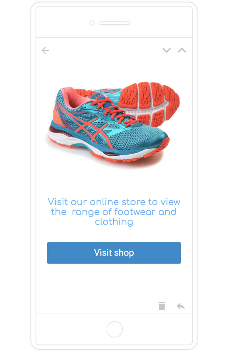
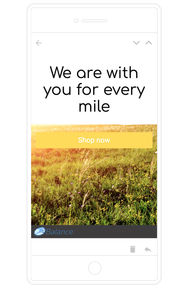
It’s also worth considering making your Call To Action large and prominent, your email subscribers should be able to clearly see this and it should be a clear instruction to do something.
It’s quite common for the Call To Action to be a large colouBlue2 button, on a small screen this really helps to stand out. Email marketing with a large button typically has a much higher conversion rate than mailers without.

Use a single-column layout
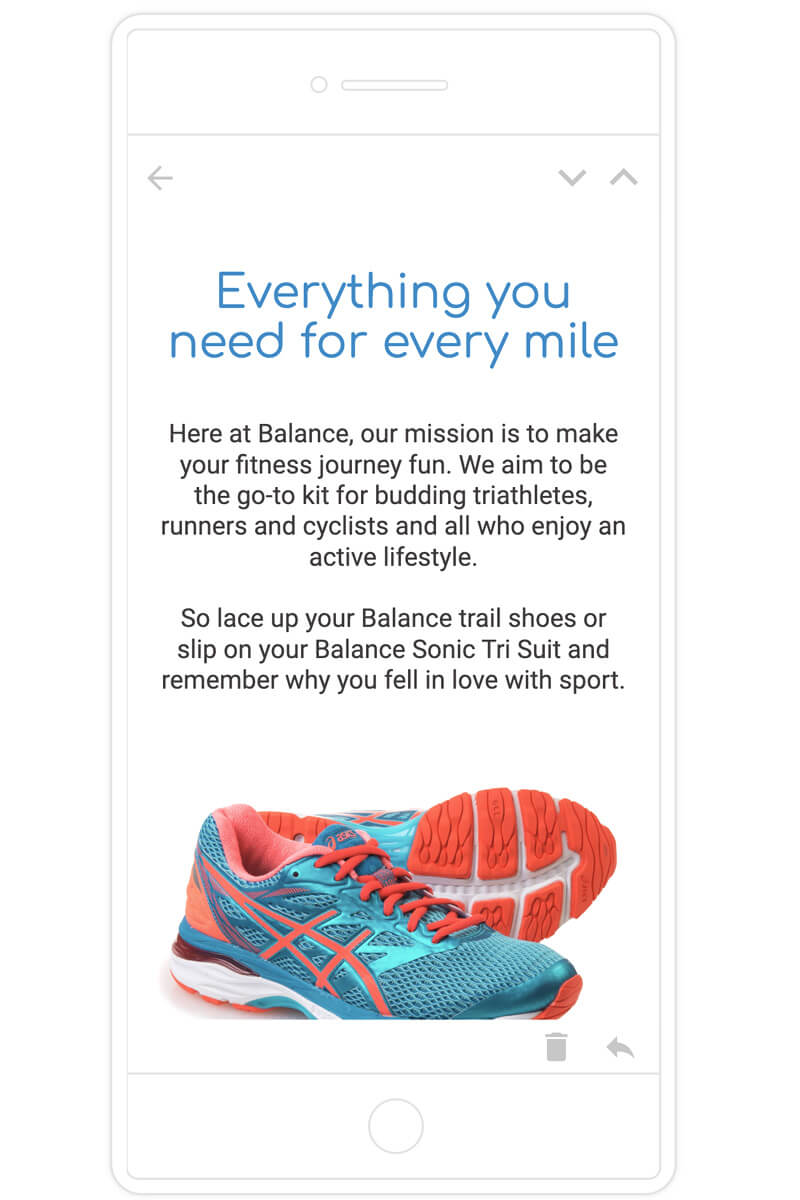
When design emailing marketing - using more than one column is a great way to ensure that if your mailer is quite content-heavy, that quite a bit of it can be above the fold. However, designs utilising this style can look very crowded when condensed onto a small mobile device screen.
For mobile devices, its’ really worth scaling down the content of your mailer and avoiding a two-column layout.
arrow_upwardMake any links stand out
As well as your Call To Action - your email marketing may have other secondary links, such as text links for example. When viewing your email on a small screen, such as a mobile device, these text links can easily get lost. Unless your viewer can clearly see them - they won’t act on them.
When your viewer is scanning the text of an email, they may not read all of the text, their eye will just scan the body looking for stand out sections. This is why it’s a really great idea to make these links stand out, this can be done by setting them to bold, or a different colour.
Using this technique really helps to increase both engagement and conversions with your email marketing subscribers.
arrow_upwardIncrease spacing and line-height
Again, keeping to the ethos of giving your mobile viewers an easier all-around viewing experience for mobile devices, increasing the line-height is a neat thing to try that really gives the text a bit more room to ‘breath’.
How many times have you seen an email on your mobile device and the body text just looks like an impenetrable wall? A neat way to avoid your mailer looking overcrowded is to increase the space between each line.
Any decent email marketing software will give the option to manually set the line-height. By doing this and increasing the font size, it really helps to maximise your email marketing viewer’s engagement with your marketing campaigns.

Test your design before sending
It may seem like an obvious one, but it’s often overlooked - we’ve all gotten into the habit of sending a test to our desktop or laptop, but also sending a copy to your mobile is often overlooked.
By sending a test, you can get an idea of where the fold is in your design and that the spacing looks correct and suited for smaller screens. iscussed, low engagement results in a poor sender reputation.
arrow_upwardUse a design editor with fluid-sizing
Any decent email marketing software will have the ability to automatically rescale your email marketing design, according to the device that your email subscriber is using to view emails. This is known as fluid sizing.
It could be that you want the email to display in the two-column format on desktop, however, on mobile, you want these two columns stacked vertically to appear as one column. If you are an email blaster user, then the template design editor will automatically do this for you.
The design editor will take things a stage further, however, giving you the option to chose which parts of your mailer are shown to desktop viewers and which parts are shown to mobile viewers.
This then gives you the ability to present a condensed content version for your mobile viewers and a full version for your desktop and laptop viewers.
arrow_upward