
Earlier this month we released the latest version of our online integrated analytics suite. From this area of your email blaster software you can quickly monitor the results of your latest email marketing campaigns.
Inside the new release, we added several new features. To help you make the most of the new features, inside this workshop we are going to cover some of the new areas inside your analytics suite and how you can make the most of your tracking data.
Selecting a campaign(s).
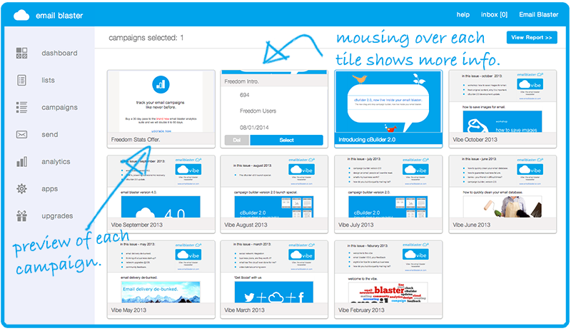
From inside your email blaster software, you can quickly access your campaign tracking suite by selecting ‘analytics’ from the main menu. After selecting this option you will be presented with the new analytics home area.
On the home area, each of your recent campaigns will be shown as ’tiles’, each tile displays a preview of the campaign, allowing you to quickly identify your mailer from a visual preview.
Placing your mouse over each tile will display several additional options to help with identification:
- Your campaign unique id number.
- The name of the mailing list it was sent to.
- The date sent.
- An option to delete if no longer required.
- Select button.
Clicking the select button enables you to highlight this campaign and other campaigns to view the associated tracking data.
When clicking the select button, your campaign tile will turn blue to show that is has been selected. One of the new features inside the new tracking suite is that you can select up to 8 email campaigns at once to view their data. When selecting multiple campaigns, the software will create an amalgamated report displaying data for all selected campaigns.
This can be quite handy if you have sent several mailers recently and wish to view a summary report of your recent activity, rather than having to view the data for each campaign individually.
When you have selected the campaign which you wish to view a tracking report for, please click the ‘view report’ button located top right of the screen.
Emails Delivered.
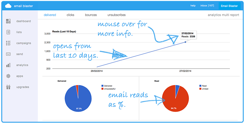
The first screen of your email campaign stats shows a summary of your emails delivered and opened. From here you can quickly monitor how many emails where successfully delivered and which recipients read your email.
Upon loading this screen, you will note that it consists of four graphs. Each graph shows information related to emails delivered and opens:
1. Email reads, last 10 days (Line Chart).
This line graph shows a breakdown of your latest email reads from the last 10 days. Your reads are displayed on a per day breakdown. This enables you to quickly monitor how quickly reads take place after a campaign has been dispatched. If you mouse over each data point, a numeric value will also be displayed.
Emails Delivered (Pie Chart).
This pie chart shows an analysis of how many emails where successfully delivered from within your email database. By default, data is shown as a percentage, therefore the chart will initially show that 99% of email where successfully delivered for example.
If you mouse over each portion of the pie chart, the exact percentage and numerical value will be displayed i.e. 99% where delivered (2,453 emails).
Email Reads (Pie Chart).
This chart enables you to quickly monitor how many of your successfully delivered emails where read. Like the previous pie chart, this by default is shown as a percentage, i.e. 58% of delivered emails where read. Again, mousing over the pie chart segment will display a more detailed breakdown with the numerical values.
Read by Country (Geo Locate).
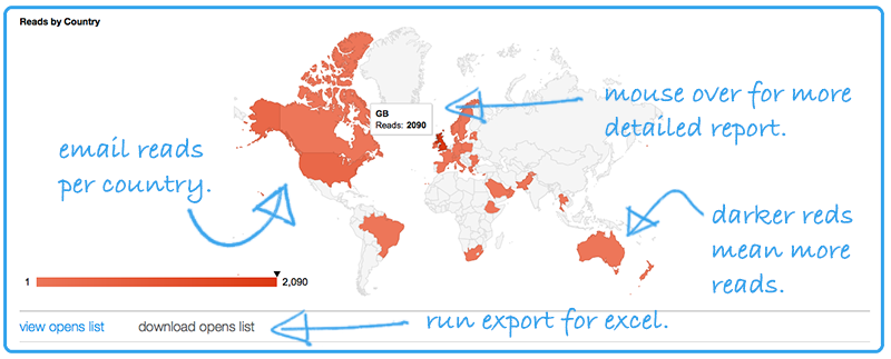
One of the new features inside the analytics suite now enables you to monitor where in the world each email read originates from. Your email reads will be displayed over a map of the world with hot spots indicating the location of each email read.
Each country where an email read has taken place will be marked in red, you may notice that some countries highlight colour is darker than others. When a country receives more email read hits, its hotspot colour will be darkened.
For more information you can also mouse over each country. For example, placing your mouse over the United Kingdom will display your email read numerical value i.e. 219 email reads.
Detailed open report.
At the bottom of this screen you also will notice two links; ‘view opens list’ and ‘download opens list’.
Via clicking on the ‘view opens list’ button you can quickly find out which users within your database read your email. The detailed report will also show the exact date and time of each email read along with the country flag to identify each users geographic location.
When clicking on the ‘download opens list’ button a .csv report will be generated and automatically downloaded to your computer. This report provides a list of your email reads which can be opened in Excel or your favourite spreadsheet application.
Clicks
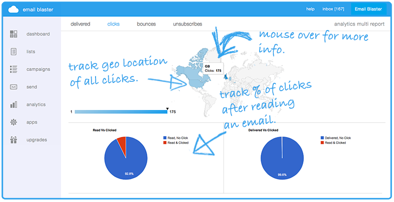
The clicks screen provides a detailed analysis of links clicked within your email campaign. If your mailer contains links to your website, via the links clicked area you can quickly monitor how many and who clicked on a link to your website. This is perfect to help determine who is interested in a product or service offered inside your mailer, to the point where a visitor has gone to your website for more information.
Clicks By Country (Geo Locate).
This first graph provides a map of the world showing hotspots of where your clicks originate from.
You will notice that a country will be highlighted in blue if a user from that country has clicked a link inside your campaign. If a country is highlighted in a darker shade of blue than others, this symbolises that more clicks have originated from that country. Placing your mouse over a country will display the exact figure of how many clicks have originated from this location.
Reads Vs Clicks (Pie Chart).
This pie chart lets you quickly track how many users clicked on a link after reading your email. This is shown in a percentage form, so you may see that 25% of users clicked on a link after reading your email.
This chart is particularly useful to help gauge audience interest. If a large percentage of email readers then clicked on a link to your website to find out more, this implies that your database is every engaged and interested in your message. A low score may indicate lack of audience interest, this could be caused by the quality of your mailing list or how clear and easy to follow your mailer is.
Delivered Vs Clicked (Pie Chart).
The delivered Vs clicked pie chart acts very similarly to the previous reads Vs clicked graph. This chart instead shows a percentage analysis of how many users clicked on a link, out of the total number of emails which where successfully delivered.
Links Clicked (Bar Chart).
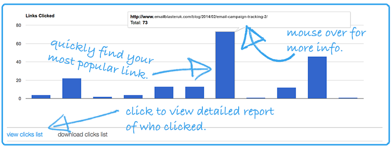
The final graph on this page lets you quickly determine the popularity of each link inside your email campaign. You mailer may contain web links to 3 or 4 products on your website. This graph will allow you to track, which links where clicked and the popularity of each link.
If you mouse over each data point of the bar chart a tooltip will appear displaying the url of each web link along with a numeric value for how many clicks it actually received.
Detailed Click Report.
At the bottom of this page you will note two web links; ‘view clicks list’ and download ‘clicks list’. Like the previous page, selecting the ‘view clicks list’ button will cause a new window to open which will allow you to quickly determine which users within your email database clicked on a link to your website. Along with this, your email blaster will also tell you the users geographic location of each click, the actual web link they viewed and the date/time of the website visit. Selecting the second option ‘download clicks list’ will run an automatic export of this data which can be opened inside Excel or your favourite spreadsheet application – perfect for further analysis.
Bounces
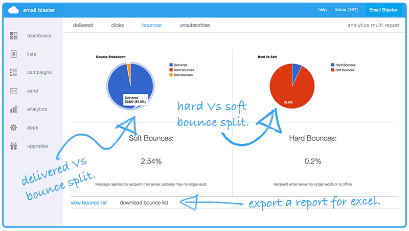 The bounces screen allows you to effectively monitor unsuccessful emails from within your mailer. A bounced email is split into two categories:
Soft Bounce. This is where we where able to locate the users email server but where unable to deliver the message to their inbox. The users inbox may be full, they may be on holiday or no longer work at the organisation.
Hard Bounce. A hard bounce occurs when we where not able to locate the users email server. It is most likely that the email account does not exist anymore.
Note: by default email blaster will automatically remove your soft and hard bounces to help save email credits. Hard bounces are removed every friday. Soft bounces which have occurred on more than two separate mailings will also be removed each friday.
Bounce Breakdown (Pie Chart).
This pie chart will enable you to quickly monitor in percentage terms, how many of your email where unsuccessful. A breakdown will be displayed, showing how many of your emails where delivered, hard and soft bounced. By default percentage figures are shown. Like other graphs, if you mouse over each pie chart segment, a numerical value will be displayed.
Hard Vs Soft (Pie Chart).
Via this pie chart you can monitor in percentage terms the split between your hard and soft bounces. This is useful to help determine the age of your database. We typically find that older databases receive a larger percentage of hard bounces.
Detailed Report.
Like other areas inside the analytics suite, the ‘view bounce list’ and ‘download bounce list’ buttons enable you to view a detailed report of which emails actually bounced. The download bounce list function enables an automatic export which can be opened inside Excel or your favourite spreadsheet application.
Unsubscribes
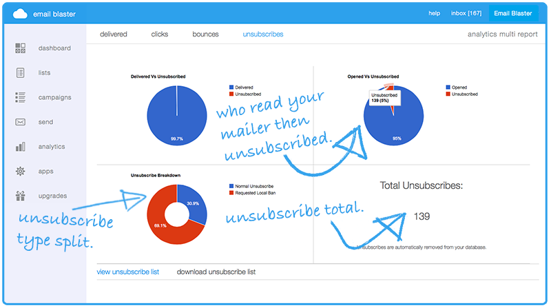
When a user unsubscribes from your mailer, they are automatically removed from your database instantly, no manual action is required. In addition to this, when a recipient is at the point of unsubscribe they are presented with two options:
A) Remove me from this mailing list. This will cause a simple delete to take place. If this user is contained within another database inside your email blaster, they will still be mailed. If you import the user at a later date, this will also cause a mailing.
B) Remove me from all mailing lists held by your company. The user will be automatically deleted from your mailing list and added to your local bans list. When added to your local bans list, this contact will be removed from all mailing lists you hold and automatically from any future database imports.
Delivered Vs Unsubscribed (Pie Chart).
This pie chart will allow you to track out of the total number of emails which were successfully delivered, a user then unsubscribed. This helps identify the level of audience interest in your mailer. A high unsubscribe vs delivered reading implies that your email recipients are not necessary interested in your message. If this is the case, we suggest re-evaluating your mailing list and help improve the engagement of your email newsletter content.
Opened Vs Unsubscribed (Pie Chart).
Providing similar information to the first pie chart, this allows you to track how many users read your email then unsubscribed. Again, we want to aim for a nice and low unsubscribe score here. Higher scores imply lack of audience interest.
Unsubscribe Breakdown.
As previously mentioned, when a user unsubscribes they are given two options (please see opening paragraph of unsubscribes for more information). The doughnut chart allows you to track the split between normal unsubscribes (option A) and requested local ban (option B). By default, these data values are displayed in percentage form. Placing your mouse over each chart segment will display the numerical values.
Detailed Report.
For a detailed report of which users actually unsubscribed, and a downloadable version for Excel (or other spreadsheet applications) – please click the corresponding ‘view unsubscribe list’ and ‘download unsubscribe list’ icons (located at the bottom of the page).
Summary.
Thank you for taking the time to read the new email blaster analytics workshop. Hopefully by now you are a pro at campaign tracking. As always, your feedback is very welcome and be sure to let us know other areas for future workshops.
