HomeEmail Blaster Q&ADo I need to optimise my email design for mobile devices?

Do I need to optimise my email design for mobile devices?

Published on

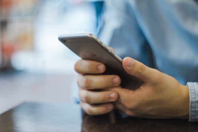
Your design does need to be optimised to display in the best viewing format for screens of all sizes, from 5-inch mobile screens to 28-inch widescreen.

The good news is that Emai Blaster will automatically do this for you. Designs created inside Email Blaster’s design-builder will be created as a fluid design. This means that they will automatically rescale to provide the optimum viewing experience on any screen size.

Latest articles

How to Find the Best Time to Send Your Email Newsletter

Timing can make or break your email marketing success. Even the most well-written and...

How to Build Loyalty with Your Email Campaigns

Email marketing isn’t just about getting clicks — it’s about building lasting relationships. While...

Why your images may not be displaying in Email Campaigns

Images play a vital role in email marketing. They grab attention, support your message,...

Have Gmail and Yahoo Killed Cold Email Marketing?

Have Gmail and Yahoo Killed Cold Email Marketing? (And why that’s actually a good thing) For...
- Try Email Blaster for free -spot_img